
Why you are (probably) using the wrong theme
- 4 minute read
- @dev.to
The problem with themes
Ever since I left my trusty notepad++, migrating to VS Code I became somewhat obsessed with finding a "perfect" theme. And by that I mean a theme that I could use without ever looking back. I tried about 30-40 themes, and some of them were really good, most were really bad.
Before you say it. Yes, peoples tastes are different and there is no theme that is objectively better. Or so you may think.
After searching I settled on Wes Bos' excellent theme Cobalt 2 for a while. Until I got irked by how bright it was, and moved to the extremely popular Night Owl by Sarah Drasner. The problem, I still wasn't entirely happy. Why italicize variable names? It makes them harder to read. Eventually I started to customize it (and like everyone else in that headspace; maybe I'd publish my own theme and gain some notoriety for it).
Deus Ex Machina
Enter, one indescript day in April. A user by the name u/kingcool1432 on reddit posts about a new theme they have made: Chandrian (a reference to an unfinished trilogy of fantasy books called The Kingkiller Chronicle).
What made this theme so special?
In the post the author claimed the following:
Chandrian is a semantic syntax highlighting theme, where the colors mean something, beyond just looking pretty. It's designed explicitly to make scanning large code-bases easier and to make errors more obvious.
Another user commented:
Isn't every theme designed to do that?
The answer should have been a resounding "Yes!". The reality is, that if that were the case then most themes have failed their job.
So how did the Chandrian theme succeed where other themes have failed?
Syntax Highlighting done right
Note! The examples I am showing in this post are from my own version of this theme. The syntax highlighting has stayed largely the same.
Let's take a look at some example HTML.
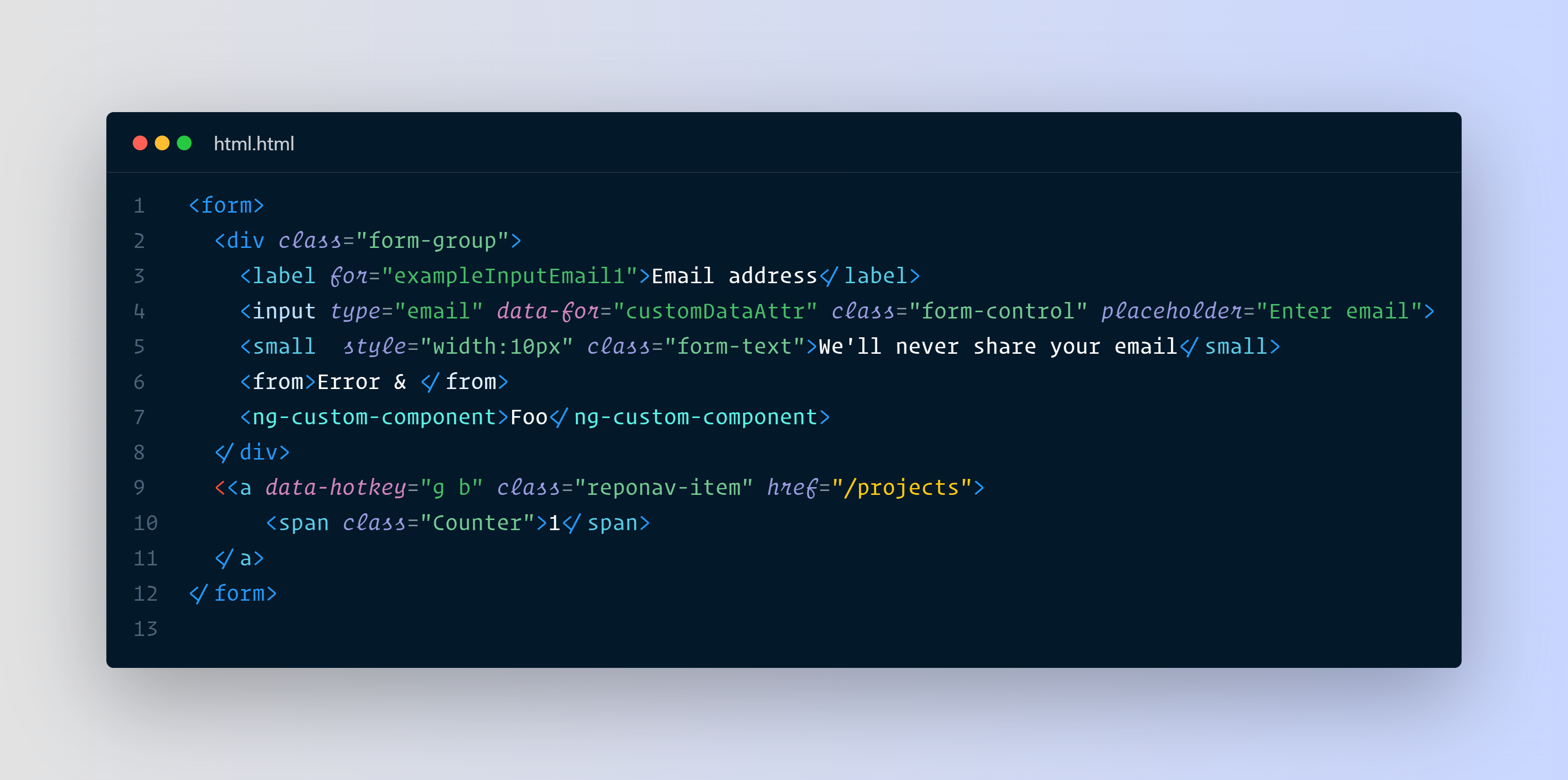
Doesn't look any different, perhaps? Did you spot the syntax error?
The syntax is highlighted in a way intended for you to recognize errors immediately in HTML, and shades of the same color are used to indicate different types of tags. Links are a stark contrasting color, while strings have their own reserved color space (and so does numbers). This red thread is interwoven throughout the whole theme. How about some SASS/CSS?

Again, the syntax is highlighted in such a way that you can easily identify different syntactical components. Variables? Orange, !important red, so as to best catch your attention. This is all carefully crafted by a person who has taken great care to understand how we read code. If you haven't already give this theme a star on github, or download it on the marketplace.
If you haven't been convinced yet, then this certainly will!

It's just so easy to skim through the code. Grammar you do not need to worry about have muted colors. Variable names are always white and functions blue, while classes are teal.
But that is standard fare, no?
Many themes make distinctions between these things. The real power of this type of syntax highlighting is how control flow pops. Red colors should be avoided, like debugger or this. While orange means you are breaking flow in some way. Yellow indicates conditionals, and in Typescript a muted rust red indicates a type declaration or interface.
And this only works because the surrounding syntax has a cool color, and so doesn't distract from the warmer colors. This is the way, without a shadow of doubt.
And for those of you who at this point are bursting with a need to be contrarian. How about some nested JSON:

What's with blue on blue?
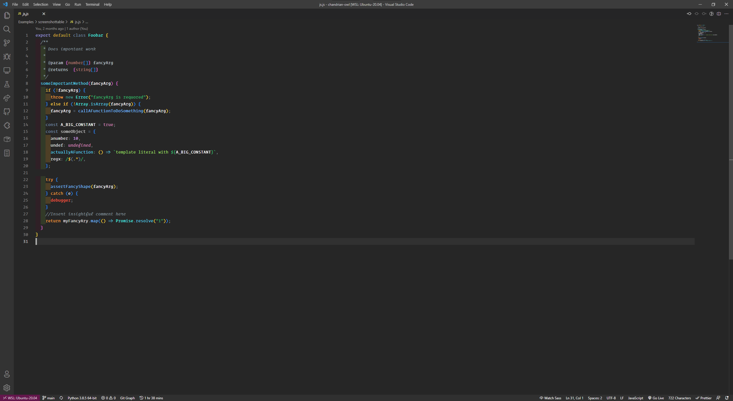
The Chandrian theme's UI is barely modified from VS Code's standard UI. And as such looks like the cover image. For reference:
This was the only gripe I had with this theme. So I took my favorite theme UI (Night Owl) and transposed the syntax highlighting on top of it. For me this works really well. I find the contrast good enough and the blue colors are relaxing to look at.

If you are like me, you can find my version of the Chandrian/Night Owl theme here.
If not, then I would at least ask you to try out the Chandrian Theme. I'll be willing to bet that you will never look at another theme the same again 🔥🦉